GUI modding in Stellaris is not easy and sometimes even not obvious either. However, there are some tools to modify existing elements or make new elements inside the game. All interface files are stored in /interface/, where .gui files are the GUI structure files, and .gfx files are the graphical sprite libraries. The first you need to know before starting, is being aware of the reload command for console; reload [file name].gui, as it greatly reduces time in between changes. Secondly, the console command guibounds will activate the UI debugging tooltip for your mouse pointer. Very handy to find which file a certain element is located. Only .gui can be reloaded when Stellaris is running, whilst .gfx and related graphical files require a complete restart.
GUI files[edit | edit source]
Element Types[edit | edit source]
These are the different types of elements that you can find when going through the Stellaris interface code. Sadly, most of them are controlled and only manipulable by hardcoded functions, which means they can't be fully used in custom GUI elements, but the default vanilla elements can all have their attributes modified. Some of these elements can be found as examples in /interface/reference.txt, whilst the rest, all around the vanilla interface files.
| Element | Type | Modability | Description | Attributes |
|---|---|---|---|---|
| containerWindowType | Container Element | Attributes and Content | The main container element when structuring the GUI. | name, position, size, moveable, clipping, orientation, origo, background, alwaysTransparent
|
| buttonType | Action Element | Attributes Only | This element is in most cases tied to a specific hardcoded action, but can also be used to display a graphical element, like a fake background. | name, position, orientation, buttonFont, buttonText, appendText, oversound, clicksound, shortcut, format, vertical_alignment, pdx_tooltip, alwaysTransparent, web_link, rotation
|
| effectButtonType | Action Element | Attributes and Effect | Similar to buttonType, just that it's manipulable with the effect attribute, which are events called from /common/button_effects/ and can run custom_gui. pdx_tooltip doesn't work for effectButtonType, so use custom_tooltip when coding button effect instead.
|
name, position, orientation, buttonFont, text, appendText, oversound, clicksound, shortcut, format, vertical_alignment, effect, alwaysTransparent
|
| iconType | Graphical Element | Attributes and Content | This element whose sole purpose is to display graphics; images, icons etc. | name, position, orientation, spriteType, quadTextureSprite, frame, scale, pdx_tooltip, alwaysTransparent, rotation, centerPosition
|
| instantTextBoxType | Text Element | Attributes and Content | This element is for displaying text, which can either be directly inserted or using localisation references. | name, position, orientation, font, text, appendText, maxWidth, maxHeight, fixedSize, format, vertical_alignment, text_color_code, pdx_tooltip, alwaysTransparent
|
| scrollbarType | Srollbar Element | Attributes and Content | This element is used to define the behavior of scrollbars for listboxType and smoothListboxType, but also for sliders as seen in the settings window. Can be used both horizontally and vertically.
|
|
| extendedScrollbarType | Srollbar Element | Attributes and Content | This element is used to define the behavior of scrollbars for containerWindowType. Can be used both horizontally and vertically.
|
|
| spinnerType | Carousel Element | Attributes and Content | This element is used to define the behavior of a clickable carousel, like seen in the settings window. | |
| guiButtonType | Action Element | Attributes Only | Same as buttonType, but specifically for scrollbars and spinnerType elements.
|
|
| positionType | Position Element | Attributes Only | Used to define positions for certain elements. These links are hardcoded. | |
| listboxType | List Element | Attributes Only | A scrollable list element that jumps between sub elements when scrolling. | |
| smoothListboxType | List Element | Attributes Only | A scrollable list element that smoothly scrolls. | name, position, size, orientation, alwaysTransparent, borderSize, spacing, scrollbartype, offset, defaultSelection, priority, autohide_scrollbar
|
| OverlappingElementsBoxType | Horizontal List Element | Attributes Only | This element displays its content horizontally and will start overlapping them if width limit has been reached. | |
| gridBoxType | Grid Element | Attributes Only | This element displays its content in a grid layout, depending on horizontal and vertical limits. | name, position, size, orientation, alwaysTransparent, slotsize, format, add_horizontal, max_slots_horizontal, max_slots_vertical
|
| checkboxType | Action Element | Attributes Only | This element is a yes/no graphical action box. | |
| editBoxType | Action Text Element | Attributes Only | This element is an editable text box, as seen when modifying names of objects in the game. | |
| dropDownBoxType | Dropdown Element | Attributes Only | Container element for expandButton and expandedWindow elements.
|
|
| expandButton | Action Element | Attributes Only | Similar to buttonType, just that it's linked to a toggleable expandedWindow element.
|
|
| expandedWindow | Toggleable Container Element | Attributes and Content | Element that is toggleable with expandButton.
|
|
| windowType | Floating Container Element (?) | Attributes Only |
Element Attributes[edit | edit source]
These are the attributes mentioned in the table above, and their functions when used properly.
| Attribute | Required | Description | Value(s) | Default State | Example |
|---|---|---|---|---|---|
| name | Yes | Name of element. Must be unique in its sibling group. | Text | name = "planet_view" | |
| position | No | Position of element, relative to parent. | [x] [y] | 0 | position = { x = 100 y = -50 } |
| size | No | Size of element. Do note that some elements use width and height, whilst others use x and y. There are 4 different types of values that can manipulate the size, but x/y elements only supports positive integers.
|
[width] [height] or [x] [y] (Depends on the element type) | 0 | size = { width = 850 height = 890 } |
| moveable | No | If element is movable. Requires the background attribute. | yes or no | no | moveable = yes |
| clipping | No | If content should clip if outside size limits. | yes or no | no | clipping = yes |
| orientation | No | Anchor point of element, relative to parent element. Use origo to define the reference point.
|
upper_left, upper_right, lower_left, lower_right, center, center_up, center_down | upper_left | orientation = lower_right |
| origo | No | Reference point for element's anchor point when using orientation. | upper_left, upper_right, lower_left, lower_right, center, center_up, center_down | upper_left | origo = center_up |
| alwaysTransparent | No | Toggles if element should be transparent towards mouse over focus. This helps with tooltip focus on larger elements or backgrounds. | yes or no | no | alwaysTransparent = yes |
| background | No | Background of element. Has its own attributes. | [name] [position] [quadTextureSprite or spriteType] [alwaysTransparent] |
background = {
	name = "background"
	position = { x = 0 y = 0 }
	spriteType = "GFX_tiles_frame"
	alwaysTransparent = yes
}
| |
| spriteType | No | Defines the element's background graphics. | Valid reference | spriteType = "GFX_tiles_frame" | |
| quadTextureSprite | No | Defines the element's background graphics. | Valid reference | quadTextureSprite = "GFX_tiled_window_transparent" | |
| frame | No | Defines if element should use a specific frame from the graphical element. | Number | 1 | frame = 3 |
| scale | No | Scales the element relative to the full size. | Number | 1 | scale = 0.75 |
| pdx_tooltip | No | Adds a hoverable tooltip, which supports localisation references. | Text or valid reference | pdx_tooltip = "my_tooltip" | |
| pdx_tooltip_delayed | No | Defines the delayed text in tooltips, which is displayed below pdx_tooltip, separated by a horizontal dash line.
|
Text or valid reference | pdx_tooltip_delayed = "my_delayed_tooltip" | |
| pdx_tooltip_anchor_offset | No | Defines if the tooltip position relative to the mousepointer. | [x] [y] | 0 | pdx_tooltip_anchor_offset = { x = 25 y = 25 } |
| pdx_tooltip_anchor_orientation | No | Defines the anchor point for the tooltip, similar to the orientation attribute.
|
upper_left, upper_right, lower_left, lower_right, center, center_up, center_down | upper_left | pdx_tooltip_anchor_orientation = lower_left |
| font | No | Specifies the font style, usually cg_16b for normal text or malgun_goth_24 for headers.
|
Valid reference | font = "cg_16b" | |
| buttonFont | No | Specifies the font style for buttonType elements, usually cg_16b for normal text or malgun_goth_24 for headers. List of default fonts are located in /interface/fonts.gfx.
|
Valid reference | font = "malgun_goth_24" | |
| text | No | Defines the displayed text for the element, which supports localisation references. | Text or valid reference | text = "my_text" | |
| buttonText | No | Defines the displayed text for buttonType elements, which supports localisation references.
|
Text or valid reference | buttonText = "my_text" | |
| appendText | No | Adds text to the end of text attribute.
|
Text or valid reference | appendText = "my_text" | |
| oversound | No | Defines if a sound should be played when mousepointer hovers over. | Valid reference | oversound = mouse_over | |
| clicksound | No | Defines if a sound should be played when clicking the element. | Valid reference | clicksound = "tab_click" | |
| show_sound | No | Defines if a sound should be played when the window is opened. | Valid reference | show_sound = "select_starbase" | |
| shortcut | No | Attaches a keyboard shortcut to the element. There's no limit on the amount of combinations, but special letters and symbols will display as a question mark in the tooltip. The supported buttons can be located in /Stellaris/gfx/keyicons
|
Key stroke(s) | shortcut = "ALT+F4" | |
| maxWidth | No | Specifies max width of element. | Number | maxWidth = 250 | |
| maxHeight | No | Specifies max height of element. | Number | maxHeight = 285 | |
| fixedSize | No | Specifies if text element size is fixed to max size limitations, or should increase with text content. | yes or no | no | fixedSize = yes |
| format (text & buttons) | No | Specifies horizontal text alignment | left, right or center | left | format = center |
| vertical_alignment | No | Specifies vertical text alignment | top, center or bottom | top | vertical_alignment = bottom |
| text_color_code | No | Specifies the color for the text. List of default colors are located in /interface/fonts.gfx, but can also be found on the Localisation Page
|
Valid reference | text_color_code = "M" | |
| tooltip_mode_enabled | No | ? | yes or no | ? | tooltip_mode_enabled = yes |
| show_position | No | Used with hide_position to animate the window transition when it opens.
|
[x] [y] | 0 | show_position = { x = -260 y = -76 } |
| hide_position | No | Used with show_position to animate the window transition when it closes.
|
[x] [y] | 0 | show_position = { x = -260 y = -76 } |
| animation_time | No | Specifies how long the transition animation should take. | Number | 0 | animation_time = 200 |
| animation_type | No | Specifies what type of animation should be used when transitioning the window element. | accelerated, decelerated, linear, smoothstep, smoothstep | animation_type = decelerated | |
| borderSize | No | Adds a padding inside the element border and the content. | [x] [y] | 0 | borderSize = { x = 10 y = 10 } |
| spacing | No | Specifies if child elements should have space between them. | Number | 0 | spacing = 5 |
| offset | No | Specifies the scrollbar position, relative to its original one. | [x] [y] | 0 | offset = { x = -5 y = 10 } |
| defaultSelection | No | ⁇ | yes or no | no | defaultSelection = yes |
| priority | No | ⁇ | Number | 0 | priority = 100 |
| autohide_scrollbar | No | Specifies if the scrollbar should always be visible, or only when the content exceeds the size constraints. | yes or no | yes | autohide_scrollbar = yes |
| slotsize | No | Specifies the size of each slot in gridBoxType.
|
[width] [height] | 0 | slotsize = { width = 100 height = 120 } |
| format (gridBox) | No | Specifies the starting point for the grid items. | UPPER_LEFT, UPPER_RIGHT, LOWER_LEFT, CENTER_UP | CENTER_UP | format = "UPPER_RIGHT" |
| add_horizontal | No | Specifies if the grid items should be added horizontally or vertically. | yes or no | no | add_horizontal = yes |
| max_slots_horizontal | No | Specifies the maximum horizontal length of the grid. | Number | max_slots_horizontal = 4 | |
| max_slots_vertical | No | Specifies the maximum vertical length of the grid. | Number | max_slots_vertical = 9 | |
| web_link | No | Specifies if clicking the button should open up the integrated web browser with the URL | Valid URL string | web_link = "https://stellaris.paradoxwikis.com/Stellaris_Wiki" | |
| rotation | No | Rotates the element relative to its initial position using the radian unit. | Number (radian) | 0 | rotation = 3.14159 |
| centerPosition | No | Specifies if the iconType element should be centered relative to its position. Best used with orientation = center_up / center_down
|
yes or no | no | centerPosition = yes |
| margin | No | Specifies if the element should have a margin between the size constraints and the internal content. | [top] [bottom] [left] [right] | 0 | margin = { top = 1 bottom = 2 left = 3 right = 4} |
| click_to_front | No | Places the window above anything else when clicked by the mouse pointer. | yes or no | no | click_to_front = yes |
| allow_multi_line | No | Defines if the editBoxType element should have multiple lines.
|
yes or no | no | allow_multi_line = yes |
| max_characters | No | Sets a character limit to a editBoxType element.
|
Number | max_characters = 1000 | |
| limited_height | No | Limits the height of a instantTextBoxType element according to the character limit.
|
yes or no | no | limited_height = yes |
| dynamic_extra_height | No | Added in Patch 3.2, this defines if the element should dynamically resize itself according to the available height, relative to its parent. Note, requires activation through the defines, by changing GUI_EXTRA_HEIGHT_MAX to a fixed pixel number, as this is set to 0 by default.
|
Number (decimal) | 0 | dynamic_extra_height = 0.5 |
| dynamic_extra_height_max | No | Specifies the maximum height in pixels the element can grow with dynamic_extra_height.
|
Number | dynamic_extra_height_max = 1000 | |
| dynamic_extra_y | No | Moves the element vertically depending on available height, relative to its parent. | Number (decimal) | 0 | dynamic_extra_y = 0.25 |
| dynamic_extra_y_max | No | Specifies the maximum distance the element can move in pixels with dynamic_extra_y.
|
Number | 0 | dynamic_extra_y_max = 200 |
Modifying GUI[edit | edit source]
More or less every element in the interface can be modified, albeit restricted through only attributes, which includes the looks of the element. In most cases, it's usually just position and size attributes that are modified, which is rather easy as you're just changing a value.
Dynamic UI Text Values[edit | edit source]
Most values displayed outside of tooltips and event windows are hard coded to link to certain internal variables. For most UI elements, any localization using bracket [] commands will just display the actual commands as static text rather than processing the commands. The exception is effectButtonType elements. If you want to display the value of a variable, the buttonText of an effectButtonType is the only localization that will work.
Dynamic Sizing[edit | edit source]
Something the game itself barely uses, is dynamic UI, which is conditional UI that can change depending on the current resolution. This can be used for every element and allows for certain attributes or elements to only have an effect if certain resolution conditions are met. It can check for both height and width, or just one of them.
if_resolution = {
	min_width = 1920  # min_width or max_width
	min_height = 1080 # min_height or max_height
	### code only applies if game is running at 1920 width and 1080 height or higher
}
This sadly can't check if user is using UI scaling option.
GFX files[edit | edit source]
GFX files are libraries for binding together the graphical sprites in graphics and the interface. When you want to add a new event image, or a resource icon, this is where you'll be adding the reference. You can have as many libraries that you want, and it's advisable to always add your changes into a new file, instead of editing the vanilla Stellaris files. This is to assure maximum compatibility as possible with other mods, and is just generally more orderly.
The structure of a sprite library is very straight forward, using the most often references as an example:
spriteTypes = {
	spriteType = {
		name = "GFX_my_eventpicture_1"
		texturefile = "gfx/event_pictures/my_event_1.dds"
	}
	spriteType = {
		name = "GFX_my_eventpicture_2"
		texturefile = "gfx/event_pictures/my_event_2.dds"
	}
	spriteType = {
		name = "GFX_resource_sr_my_new_resource"
		textureFile = "gfx/interface/icons/resources/new_resource.dds"
	}
}
A few notes that could come in handy:
- Every name has to be unique, so it's smart to add an abbreviated prefix of your modname between `GFX_` and the reference.
- You can reference the same file multiple times.
- The folder structure is irrelevant, but utilizing it is very advisable.
Common Sprites[edit | edit source]
There are 4 types of sprites that you can reference. The most common, which were used in the example above, is spriteType, which is a static sprite that'll resize itself depending on the referenced graphical sprite. On the other hand, you have corneredTileSpriteType, which turns the image in to a tileable sprite, that can be resized through the interface code. This is often used to reference backgrounds or frames. There's also the more uncommon portraitType and progressbarType, which will be described further below.
These are the attributes you can use when using spriteType or corneredTileSpriteType.
| Attribute | Required | Description | Value(s) | Default State | Example |
|---|---|---|---|---|---|
| name | Yes | Name of element. Must be unique. | Text | name = "GFX_my_image" | |
| textureFile | Yes | Path to image file. Relative to the Stellaris installation folder. | Valid reference | textureFile = "gfx/my_mod/icons/my_icon.dds" | |
| alwaystransparent | No | Defines if the element using this reference should always be transparent, and not manipulable by pointer actions. | yes or no | no | alwaystransparent = yes |
| borderSize | No | Defines a border threshold before the texture should be tiled. Only used for corneredTileSpriteType.
|
[x] [y] | 0 | borderSize = { x = 80 y = 80 } |
| effectFile | No | Attaches an effect to the element. | Valid reference | effectFile = "gfx/FX/buttonstate_onlydisable.lua" | |
| masking_texture | No | Adds a mask layer to hide certain parts of the texture. | Valid reference | masking_texture = "gfx/interface/situation_log/event_mask.dds" | |
| noOfFrames | No | Defines how many frames there are in the texture. Used in certain images where there are multiple icons. | Number | 0 | noOfFrames = 12 |
Uncommon Sprites[edit | edit source]
portraitType and progressbarType info will come here.
| Attribute | Required | Description | Value(s) | Default State | Example |
|---|---|---|---|---|---|
| name | Yes | Name of element. Must be unique. | Text | name = "GFX_my_image" | |
| effectFile | No | Attaches an effect to the element. | Valid reference | effectFile = "gfx/FX/buttonstate_onlydisable.lua" | |
| masking_texture | No | Adds a mask layer to hide certain parts of the texture. | Valid reference | masking_texture = "gfx/interface/situation_log/event_mask.dds" | |
| type | yes | Defines what type of element this portrait contains. | Valid reference | 0 | type = planet |
| character | no | Defines if the portrait should contain a character. | yes or no | no | character = yes |
Animation Layer[edit | edit source]
The animation property is a sublayer which can animate spriteType elements in certain ways.
More info will be added.
animation = {
	animationmaskfile = "gfx/mask/my_mask.dds"
	animationtexturefile = "gfx/animation/my_animation_texture.dds"
	animationrotation = 90.0
	animationlooping = yes
	animationtime = 50.0
	animationdelay = 0.0
	animationblendmode = "multiply"
	animationtype = "scrolling"
	animationrotationoffset = { x = 0.0 y = 0.0 }
	animationtexturescale = { x = 1.0 y = 1.0 }
	animationframes = { 1 2 3 }
}
Custom Windows[edit | edit source]
PDX Modding doesn't give us a direct method to create our own windows and screens, in most cases you can only change some existing interfaces. But sometimes we want to polish our mods and want to make better screens with different options, buttons or graphics and the default event window is really far from our needs. However, there is a small trick — we can use custom_gui screens for diplomatic events. Despite that they are called diplomatic, you can use them in other cases.
Start[edit | edit source]
You have to define this custom window inside an event script:
country_event = {
	…
	diplomatic = yes
	custom_gui = "irm_view_sector_control"
	…
}
Where irm_view_sector_control is refer to specific containerWindowType describing your interface window. They have to be absolutely similar, in other cases game crashes.
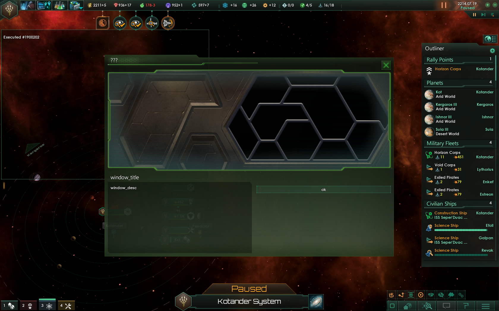
So, as a result, we'll get such window (I'm using enclave_trader_window as an example): Media:Custom GUI window example 0.png. As you can see, there is no portrait, empire name and other information, as we don't call this event as diplomatic, but it doesn't matter. Now we have to clean it up to remove all unnecessary elements.
Сlearing[edit | edit source]
We are not allowed to delete existing items and containers, as game won't find required gui instances and will crash, so we must hide all of them. Well, I don’t want to use background picture with portraits, so I’ll set their size to zero. You should change sizes within next containers:
containerWindowType = { name = "portrait_background" … }
containerWindowType = { name = "portrait" … }
Just set width and height to zero, like this:
containerWindowType = {
	name = "portrait"
	position = { x = 17 y = 45 }
	size = { width = 0 height = 0 } # hide portrait window
	clipping = yes
	…
}
And we also could shift it somewhere outside the visible screen in position section. I also want to hide dark background under window description text.
buttonType = {
	name = "alien_message_background"
	size = { x = 485 y = 240 }
	position = { x = -1110 y = -11430 } # hide this
	spriteType = "GFX_tiles_dark_area_cut_8"
	alwaysTransparent = yes
}
If we don't want to use any options, so, let’s hide this section as well.
listboxType = {
	name = "option_list"
	position = { x = 11450 y = 11175 } # hide
	backGround=""
	size = { x=-0 y=-0}
	spacing = 1
	scrollbartype = "standardlistbox_slider"
	borderSize = { x = 0 y = 0 }
	Orientation = "UPPER_LEFT"
}
So now we have an empty and clean screen. I want to resize it a bit and rearrange text sections to make it better. And to add a window header. Let’s copy heading and displace it somewhere far:
instantTextBoxType = {
	name = "heading"
	font = "malgun_goth_24"
	text = "DIPLOMACY"
	position = { x = -1120 y = -1115 } # hide
	maxWidth = 543
	maxHeight = 22
	fixedSize = yes
	alwaysTransparent = yes
}
We can use a custom section for our header (don’t forget to rename the textbox):
# Custom header
	instantTextBoxType = {
	name = "irm_some_header"
	font = "malgun_goth_24"
	text = "ui_some header" # header text, linked to localization file
	position = { x = 20 y = 5 }
	maxWidth = 543
	maxHeight = 22
	fixedSize = yes
	alwaysTransparent = yes
}
Stretching our window box, and applying better background:
containerWindowType = {
	name = "irm_faction_overview"
	…
	size = { width = 660 height = 300 } # new size
	background = { name = "background" quadTextureSprite ="GFX_tile_outliner_bg" }
}
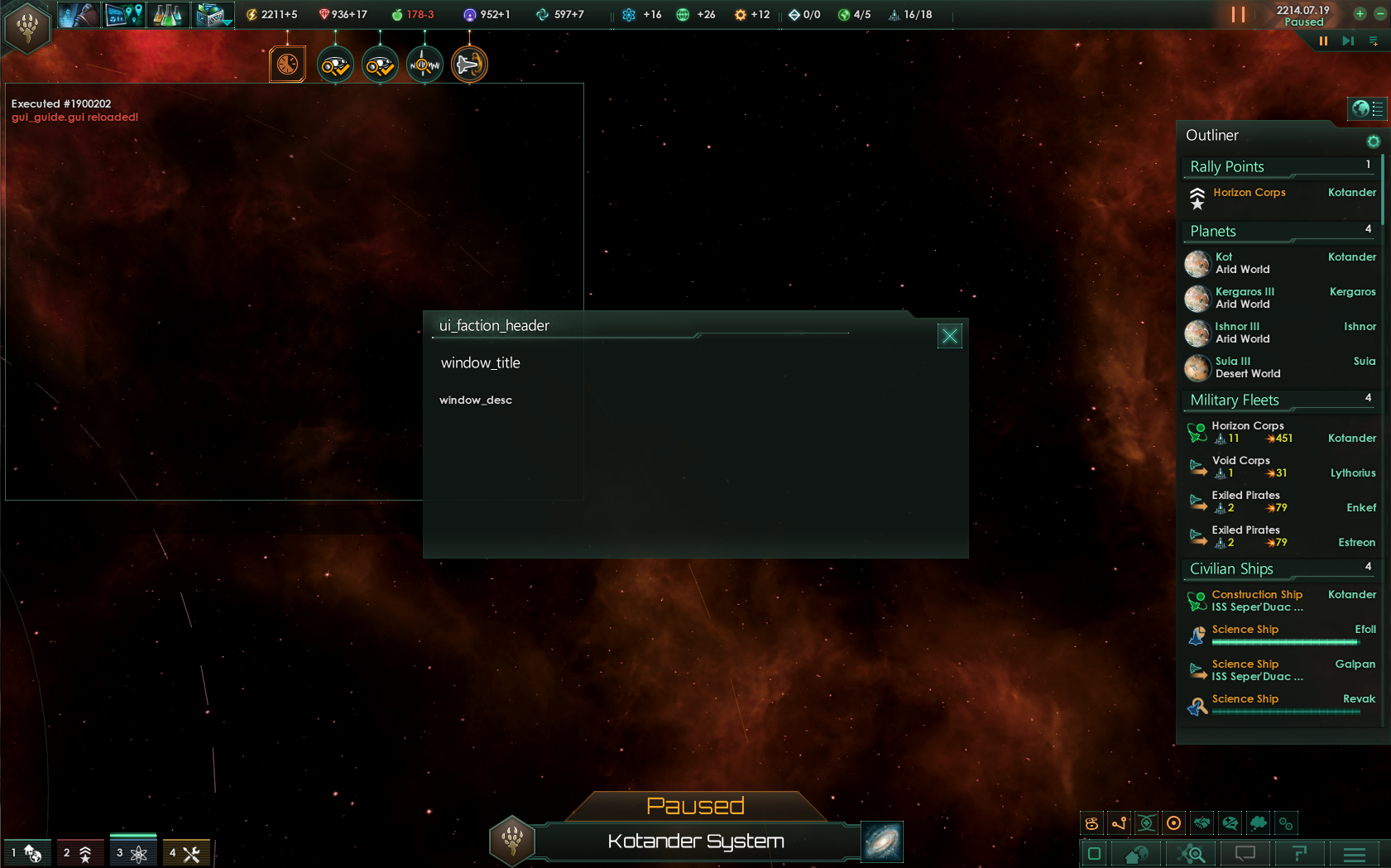
Well, if we've done everything right, we'll get something like this: Media:Custom GUI window example 1.png
Sample GUI File[edit | edit source]
In this file I've replaced all unnecessary elements, erase all unnecessary stuff for some unused fonts etc. and gathered them in a one block. Note: don't rearrange the logic of containers, they have to be in original sequence.
guiTypes = {

	### FACTION OVERVIEW GUI ###

	containerWindowType = {
		name = "irm_faction_overview"
		orientation = center
		origo = center
		moveable = yes
		size = { width = 660 height = 300 }

		background = { name = "background" quadTextureSprite ="GFX_tile_outliner_bg" }

		iconType = { name = "hex_bg" spriteType = "GFX_hex_bg" position = { x = -10 y = -14 } alwaysTransparent = yes }
		iconType = { name = "empire_header_line" quadTextureSprite = "GFX_line_long" position = { x = 6 y = 22 } alwaysTransparent = yes }

		buttonType = {
			name = "close"
			quadTextureSprite = "GFX_close"
			position = { x= -42 y = 12 }
			Orientation = "UPPER_RIGHT"
			shortcut = "ESCAPE"
			clicksound = "back_click"
		}

		# Custom header
		instantTextBoxType = {
			name = "irm_some_header"
			font = "malgun_goth_24"
			text = "ui_faction_header" 	# header text
			position = { x = 20 y = 5 }
			maxWidth = 543
			maxHeight = 22
			fixedSize = yes
			alwaysTransparent = yes
		}

		### ALL OF THIS IS HIDDEN OR DISPLACED ! ###

		buttonType = { name = "focus_button" position = { x = -1180 y = -1112 } spriteType = "GFX_fleetview_focus" } # hidden
		instantTextBoxType = { name = "heading" font = "malgun_goth_24" position = { x = -1120 y = -115 } } # hidden
		buttonType = { name = "alien_message_background" size = { x = 0 y = 0 } position = { x = -1110 y = -11430 } spriteType = "GFX_tiles_dark_area_cut_8" } # hidden
		buttonType = { name = "confirm_button" quadTextureSprite = "GFX_standard_button_142_34_button" } # hidden
		containerWindowType = {
			name = "portrait_background"
			position = { x = -1117 y = -1145 }
			size = { width = 0 height = 0 } 	# hide portrait window
			iconType = { name = "event_picture" spriteType = "GFX_diplomacy_portrait_frame" } # hidden
			iconType = { name = "portrait" spriteType = "GFX_portrait_character" } # hidden
		}
		containerWindowType = {
			name = "portrait"
			position = { x = -1117 y = -1145 }
			size = { width = 0 height = 0 } # hide portrait window
			iconType = { name = "portrait" spriteType = "GFX_portrait_gamesetup_mask" } # hidden
			iconType = { name = "black_frame" spriteType = "GFX_diplomacy_portrait_shadow_frame" } # hidden
			iconType = { name = "stripes_1" spriteType = "GFX_diplomacy_stripes_2" } # hidden
			iconType = { name = "city_frame" spriteType = "GFX_diplomacy_portrait_frame" } # hidden
		}
		iconType = { name = "empire_info_bg" spriteType = "GFX_diplomacy_dark_fade_bg" } # hidden
		instantTextBoxType={ name = "empire_name" font = "malgun_goth_24" } # hidden
		instantTextBoxType={ name = "empire_government_type" font = "cg_16b" } # hidden
		instantTextBoxType={ name = "empire_personality_type" font = "cg_16b" } # hidden
		OverlappingElementsBoxType = { name = "empire_ethics_icons" position = { x = -1145 y = -11138 } } # hidden
		iconType = { name = "empire_flag" spriteType = "GFX_empire_flag_128" position = { x = -1125 y = -11235 } } # hidden
		containerWindowType = {
			name = "leader_details"
			position = { x = -1125 y = -1175 }
			containerWindowType = { name = "empire_traits_box" } # hidden
			instantTextBoxType = { name = "empire_traits_label" font = "cg_16b" } # hidden
			overlappingElementsBoxType = { name = "leader_traits" } # hidden
			instantTextBoxType = { name = "leader_name" font = "cg_16b" } # hidden
			instantTextBoxType = { name = "leader_species" font = "cg_16b" } # hidden
		}
		containerWindowType = {
			name = "opinion_window"
			position = { x = -1127 y = -11110 }
			size = { width = 94 height = 30 }
			iconType = { name = "their_opinion_icon" spriteType = "GFX_diplomacy_opinion" } # hidden
			instantTextBoxType = { name = "their_opinion" font = "cg_16b" }
		}

		### EVENT DIPLO ###

		containerWindowType = {
			name = "EVENT_DIPLO"
			position = { x = 2 y = 50 }
			#size = { width=563 height=220 }
			moveable = no

			instantTextBoxType={
			 name = "action_title"
			 font = "malgun_goth_24"
			 position = { x = 20 y = 0 }
			 maxWidth = 200
			 alwaysTransparent = yes
			}
			instantTextBoxType={
			 name = "action_desc"
			 font = "malgun_goth_24"
			 position = { x = 490 y = 0 }
			 maxWidth = 500
			 maxHeight = 180
			 Orientation = "UPPER_LEFT"
			 format = center
			 alwaysTransparent = yes
			 text_color_code = "H"
			}
			listboxType = { name = "option_list" position = { x = -11500 y = -1130 } } # hidden option list
		}
		# Description Section
		instantTextBoxType = {
			name = "alien_message"
			font = "cg_16b"
			position = { x = 20 y = 100 }
			maxWidth = 465
			maxHeight = 220
			format = left
			scrollbartype = "standardtext_slider"
		}
	}
}
| 帝国 | 帝国 • 思潮 • 政府 • 国民理念 • 起源 • 承诺 • 议程 • 传统 • 飞升天赋 • 法令 • 政策 • 遗珍 • 科技 • 自定义帝国 |
| 人口 | 岗位 • 派系 |
| 领袖 | 领袖 • 领袖特质 |
| 物种 | 物种 • 物种特质 |
| 行星 | 行星 • 行星特征 • 轨道矿藏 • 建筑 • 区划 • 行星决议 |
| 星系 | 星系 • 恒星基地 • 巨型结构 • 虫洞 • 星门 • 地图 |
| 舰队 | 舰队 • 舰船 • 部件 |
| 地面战 | 陆军 • 轰炸姿态 |
| 外交 | 外交 • 联邦 • 星海共同体 • 评价修正 • 宣战理由 • 战争目标 |
| 事件 | 事件 • 异常现象 • 特殊项目 • 考古遗址 |
| 游玩 | 游玩 • 定义 • 研究 • 经济 • 游戏开局 |
| 动态修改 | 动态 • 指令效果 • 触发条件 • 作用域 • 修正 • 变量 • AI |
| 媒体/本地化 | Maya 导出器 • 图形 • 肖像 • 旗帜 • 事件图片 • 界面 • 图标 • 音乐 • 本地化 |
| Other | 控制台命令 • 存档编辑 • Steam 创意工坊 • 模组制作教程 |